
Original

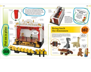
I looked long and hard for days, looking for something that had more than one font on it, looking at posters, ads, and magazines. What I discovered is this seems to be the norm at this time, one font with a couple of variations of the font. Sometimes it was italics, bold, or just larger font size. One other thing that is obvious is that about 90% of the fonts out there are sans serif, the only exception seemed to be Apple, theirs is pretty much serif. This made me wonder if serif is a thing of the past. This page here is from a book, 365 Things To Do With Lego Bricks, it was produced and distributed by Dorling Kindersley. I originally found the page on Google images, which directed me back to Amazon. This page actually has three different fonts, slab serif and two different sans serif fonts.
Size
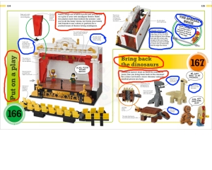
The first thing that catches the eye is the large slab serif font, the title of each creation. Other than the large photo, these two headers or titles are the main focal point of the page. Along with the large slab serif font we see a corresponding smaller slab serif font giving the description of the item.
Like wise, the sans serif font also has a larger and a smaller size of the same font. We see the header, The Special Brick, in contrast with the much smaller text below it, as well as the little descriptions located around the entire page.
Weight

Starting off with the slab serif font, both the large and small font do have thick lines, however, since the title is larger in size, it is also thicker. This is also the case with the sans serif font, the larger text size is thicker than the smaller one.
Also we need to compare the slab serif with the sans serif and comic sans serif. The slab serif font has by far, the thicker lines. Look at the title and compare it to the little descriptions that are located around the page, the header is brought into the foreground and the descriptions fall into the background.
The one thing that all three fonts have in common is that they are monoweight. None have thick and thin lines, only thick. I believe this ties the fonts together giving a pleasing look to the page.
Structure

Lets compare the two sans serif fonts. The one that is used primarily throughout the page is modern looking and looks somewhat computer generated. While the comic sans serif looks more like a child’s handwriting. These two differ greatly in appearance even though they are both sans serif.
The slab serif has more of a formal look, something that you might see in calligraphy, minus the thick and thin lines we would associate with calligraphy.
All three have their own distinct look and you aren’t left wandering if they are the same font.
Direction
For the most part, about 95% of the text is horizontal. There are a couple of twists though. The first thing that draws our eye into the page is the vertical text of the title of the item. Again, it is up front, in the foreground, while the other text falls behind.
The other twist, and also an eye catcher, is the text that is on a diagonal. Now the book advises against using text diagonally, but this actually denotes a special product. Without any effort you can tell that this lego isn’t the same as the others, it screams, “look at me!”
Color

It’s clear that all the text on this page is in varying shades of black. If you look at the two titles, as well as the item numbers, the use of both warm and cool colors make the font stand out even more. Try to imagine the titles without color, they would just blend into the page, be sent into the background. The use of color tells us that it is something important.
Form

The last thing is the form, is this page all in caps or lower case, or a combination of both? There are only a few things that are in all caps, the special brick header, the comment bubbles, and the word STAGECRAFT. If the page were in all caps, it would be harder to read, take up much more space, and may give the impression that we are being yelled at. With the limited use, it serves to draw our eye to the important information.
